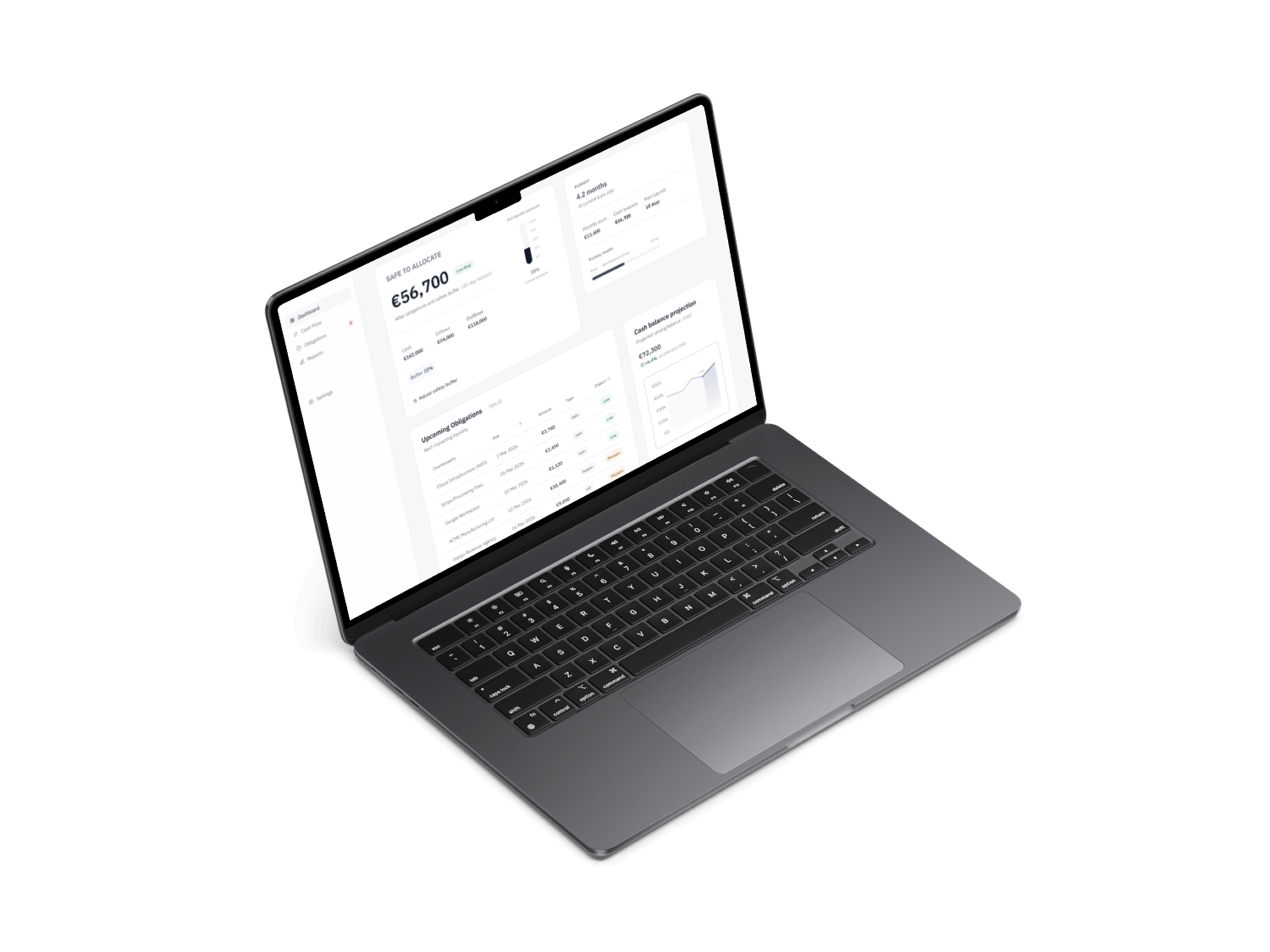
Liquid
SaaS B2B liquidity management dashboard designed to help finance teams analyze cash flow, assess risk, and make data-driven decisions.
Role
Product Designer
Year
2026
Overview
A system designed to help finance teams understand available liquidity, assess risk, and plan short-term cash flow. It provides a structured way to move from raw financial data to clear understanding of available cash, risk exposure, and future obligations.
Problem
Finance teams struggle to answer critical questions: How much cash is actually available? How much is already committed? How long can we operate? What payments are coming up? Data is often fragmented and hard to interpret, leading to uncertainty and slower decision-making.
Core Structure
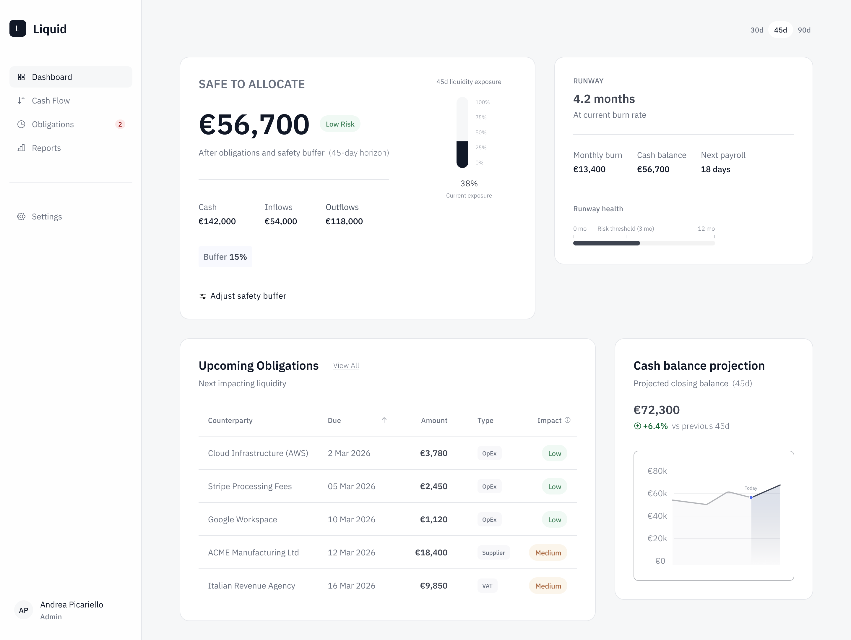
Dashboard
Answers four key questions about the current financial position: available liquidity, risk exposure, operational runway, and upcoming obligations.
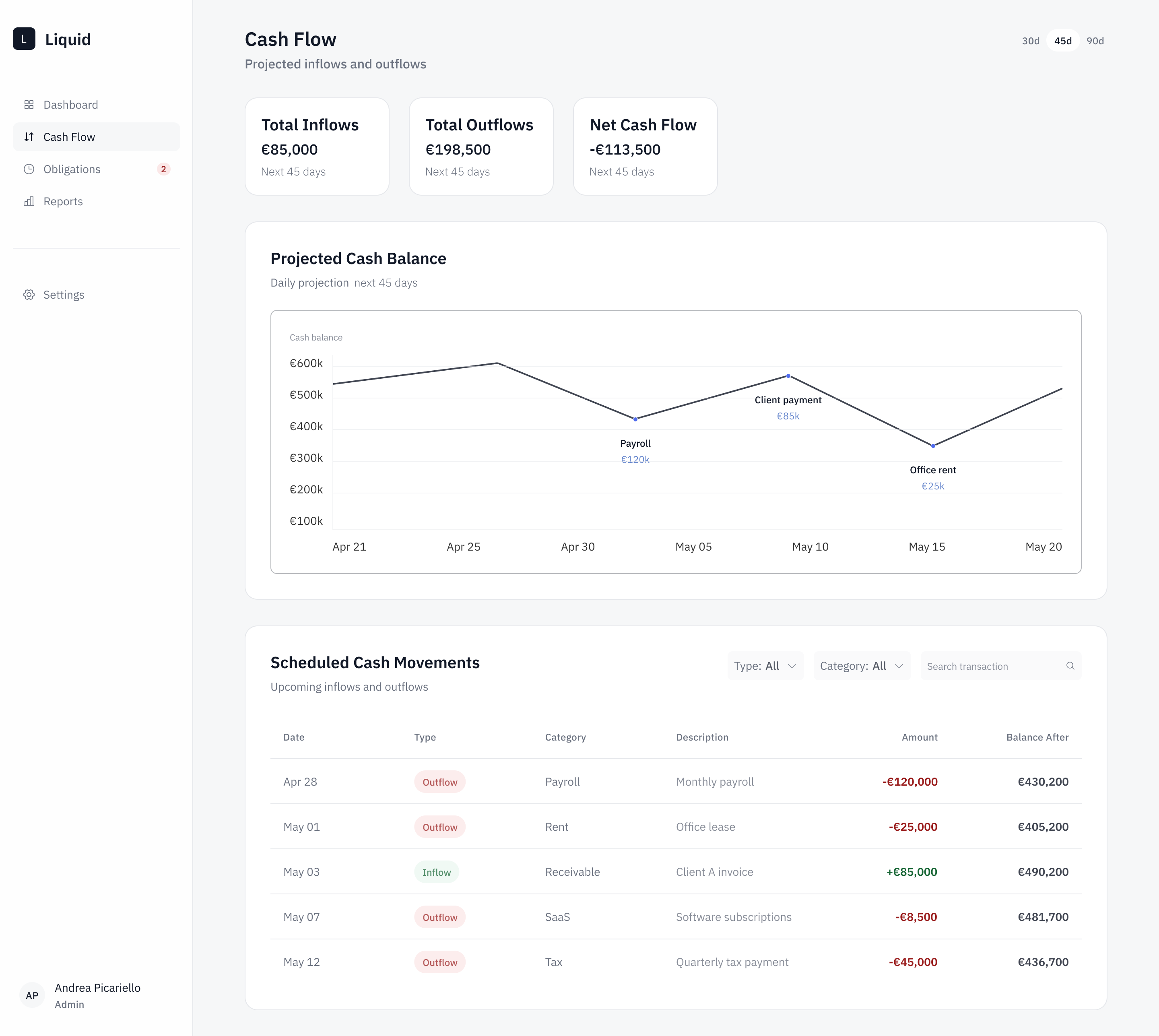
Cash Flow
Focuses on how liquidity evolves over time, separating inflows, outflows, and net result to show whether the business is generating or consuming cash.
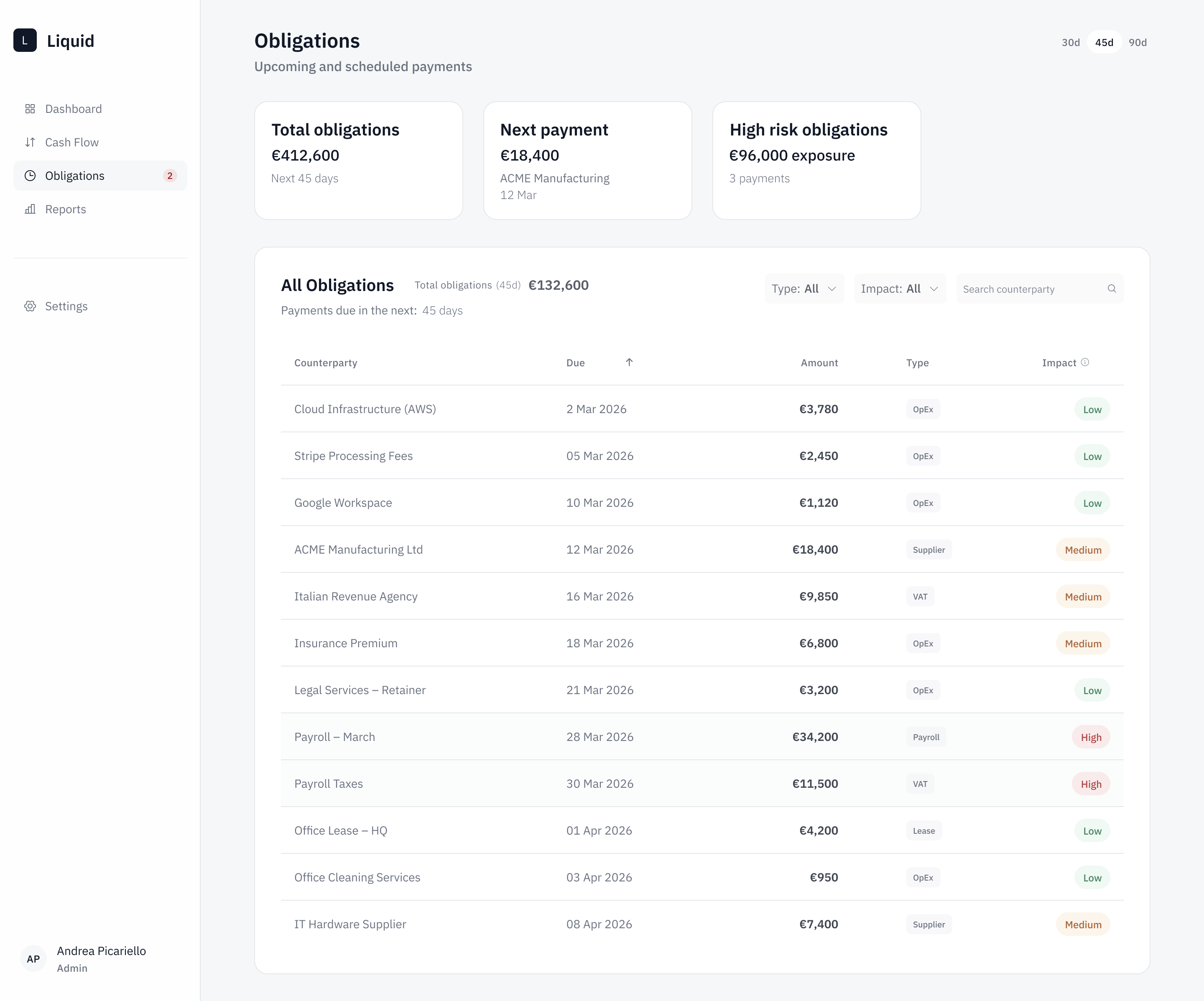
Obligations
Shows all upcoming payments ordered by date, enriched with impact level and filterable by type and risk.
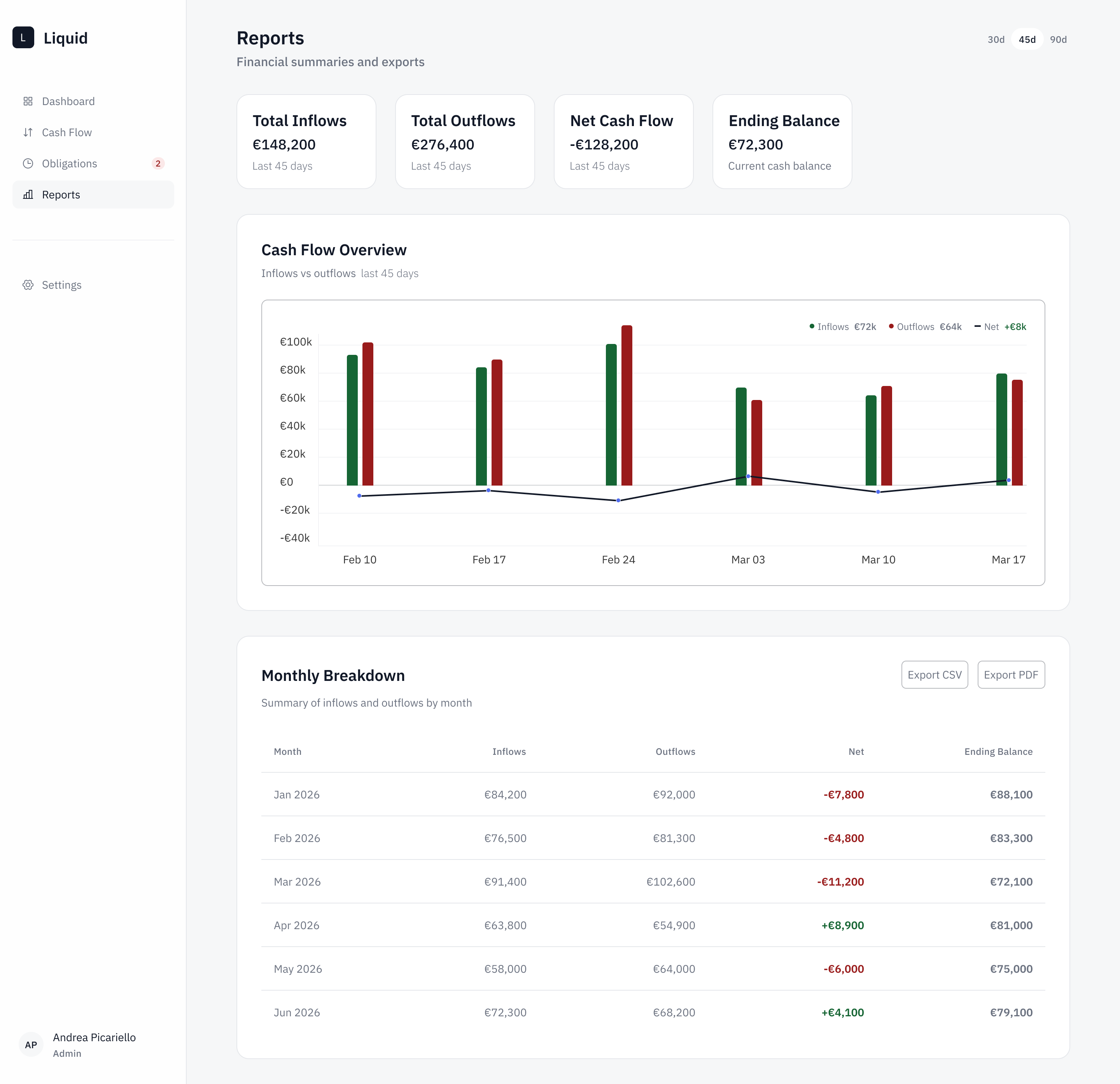
Reports
Provides a higher-level overview with aggregated inflows and outflows, monthly breakdown, and net result for reflection and communication.
Key Design Decisions
Clear distinction between total and usable liquidity
Not all available cash is free to use — the design makes this immediately visible.
Global time horizon
All views are aligned to the same time range, so users can switch between perspectives without losing context.
Separation of data layers
KPI, charts, and tables serve different purposes and different levels of detail.
Consistent data model
Tables share the same structure across views, reducing cognitive load when moving between sections.
High information density
Designed for real usage by finance professionals who need depth, not simplification.
Outcome
The result is a decision-support system that takes finance teams from fragmented data to clear answers about available cash, risk exposure, and runway — with the framing and structure doing the heavy lifting, not visual polish alone.
How I'd measure success
I'd test whether users answer the four core questions — available liquidity, committed cash, runway, upcoming obligations — faster and with fewer errors than in their current tools, and whether they move across time horizons without losing context. First study: comprehension of the total-vs-usable liquidity distinction.
Learnings
Designing financial tools is not only about visual clarity. The main challenge is how data is framed — the way information is structured and presented has a direct impact on how users interpret and act on it.