01
01
Steady
Steady
I designed Steady as a fictional banking app that challenges feature-heavy neobanks.
Instead of adding more tools, I focused on trust, transparency, and reducing user anxiety.
This project explores how a simple, focused experience can solve core banking
problems better.
I designed Steady as a fictional banking app that challenges feature-heavy neobanks.
Instead of adding more tools, I focused on trust, transparency, and reducing user anxiety.
This project explores how a simple, focused experience can solve core banking
problems better.
I designed Steady as a fictional banking app that challenges feature-heavy neobanks.
Instead of adding more tools, I focused on trust, transparency, and reducing user anxiety. This project explores how a simple, focused experience can solve core banking problems better.
YEAR
YEAR
2026
2026
SERVICE
SERVICE
UX/UI
UX/UI
Branding
Branding
COMPANy
COMPANy
Personal Project
Personal Project
The Problem
Most modern banking apps offer many features, but often create stress and confusion.
When something goes wrong, users face unclear messages, blocked accounts, and poor support.
Instead of feeling in control, people feel anxious and powerless.
I designed Steady to explore a different approach: solving the core banking problems with clarity, trust, and simplicity.
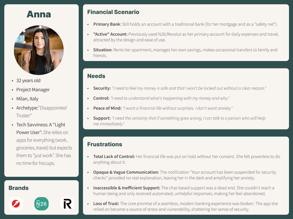
Product Definition
I designed Steady by starting from user pain points, not from features.
Each design choice is linked to a specific problem in the banking experience.
The interface, flows, and messages are built to prevent confusion and reduce user stress.
The goal was not to add complexity, but to remove friction and uncertainty.
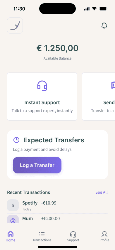
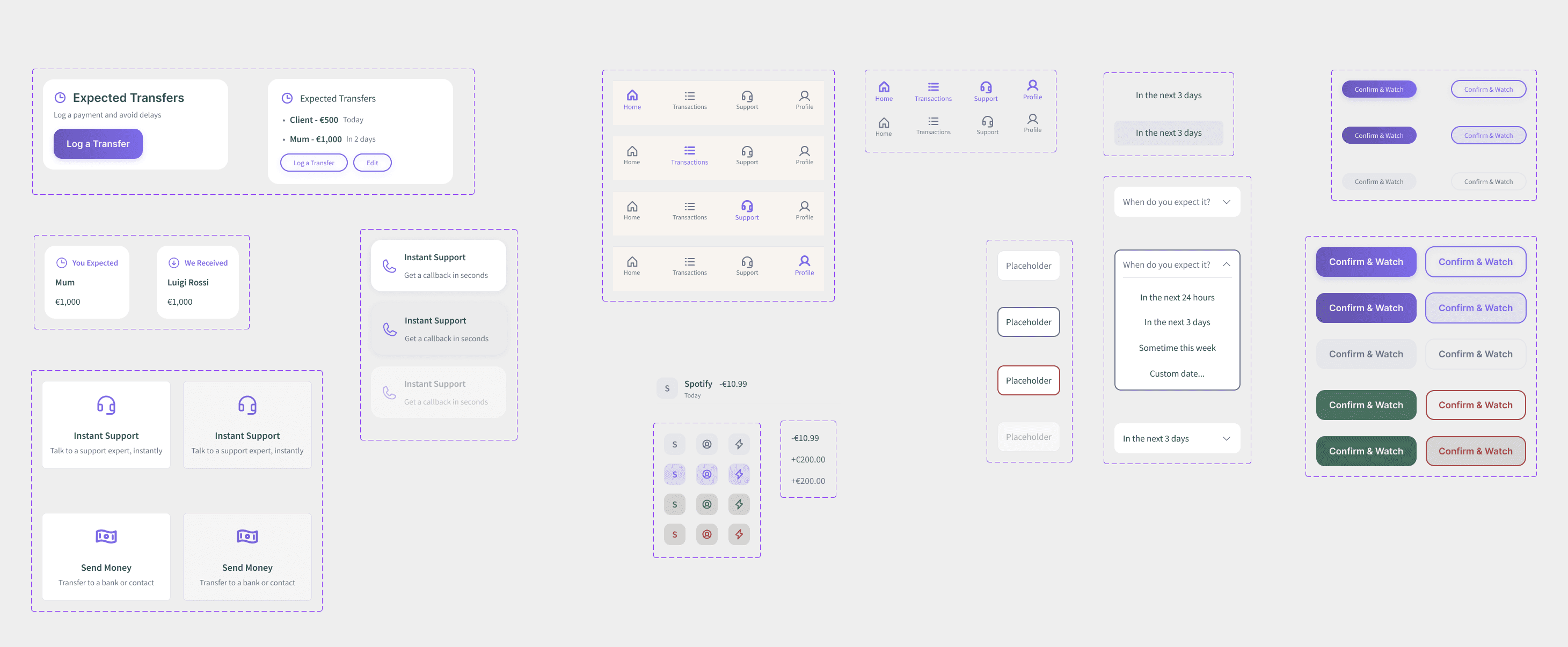
Reducing Cognitive Load
on the Home Screen
Most banking apps overload the home screen with data and actions.
In Steady, I designed the home screen to show only what is essential.
The balance is shown as a single large number, with a small label for clarity.
Primary actions are presented as large cards instead of small buttons, making them easier to see and tap.
This helps users understand the app at a glance and feel immediately oriented.
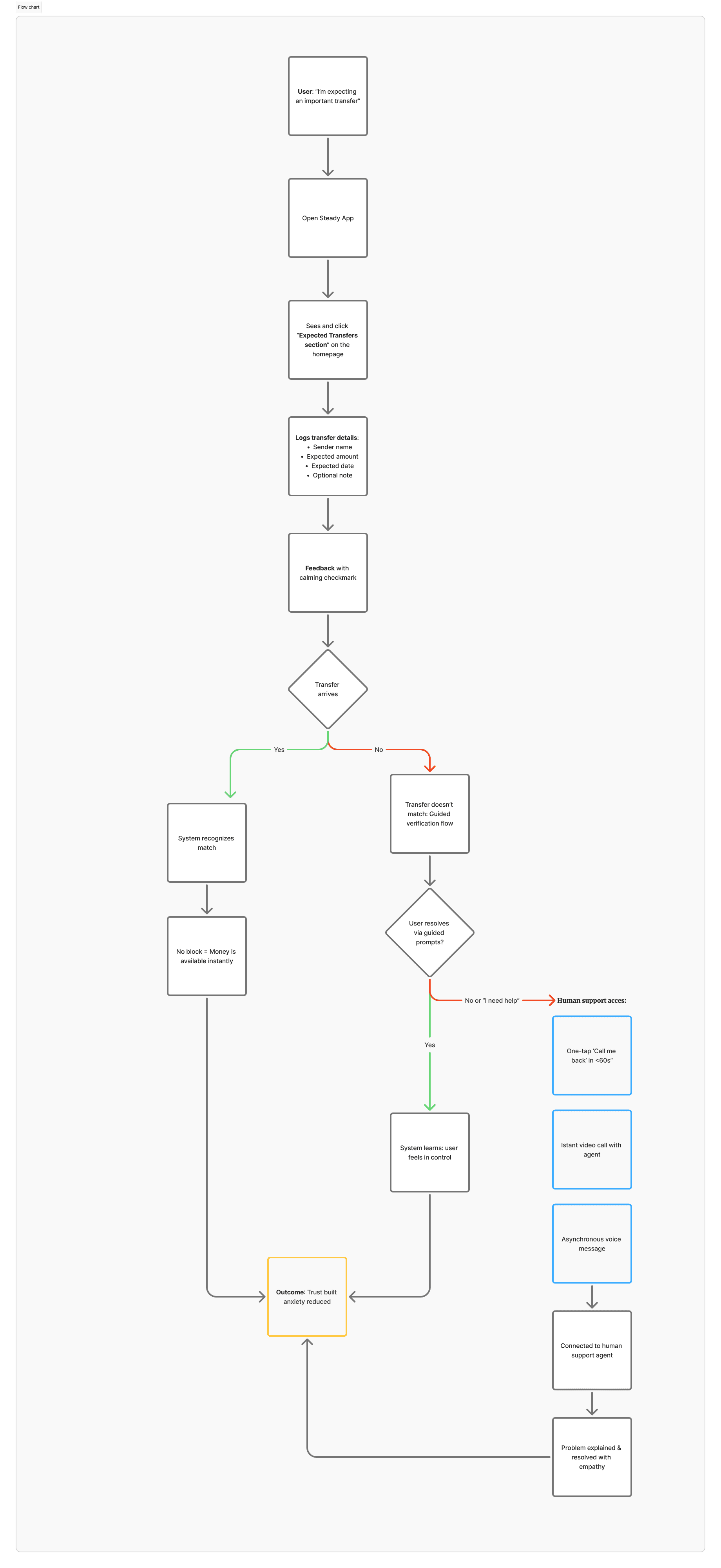
Preventing Problems Before
They Happen
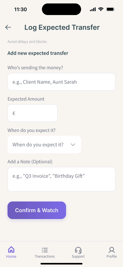
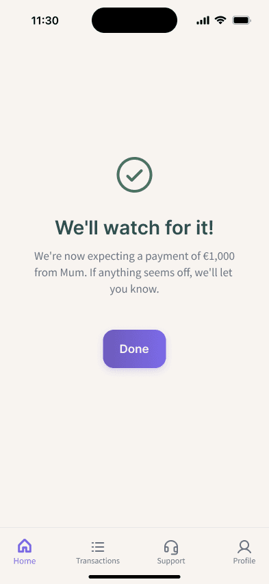
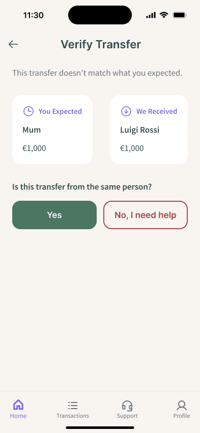
One of the main causes of user anxiety is unexpected incoming payments.
To address this, I designed the “Expected Transfers” section as a core element of the home screen.
Users can register an incoming transaction in advance, adding sender, amount, and timing.
If a transfer is expected, it is clearly listed; if not, the app suggests adding one.
This design choice shifts the experience from reactive control to proactive prevention.
Making Human Support
Always Visible
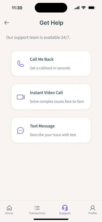
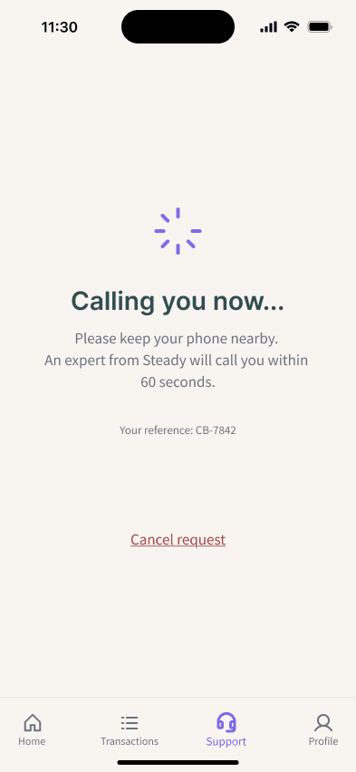
While Steady resolves most issues through guided in-app flows, human support
remains essential.
For this reason, Instant Support is not hidden in a menu, but placed directly on the
home screen.
The support card promises a callback from a real expert in under 60 seconds.
This clear and visible guarantee reassures users before problems even occur.
The goal is to make users feel supported, not abandoned, at any point in the experience.
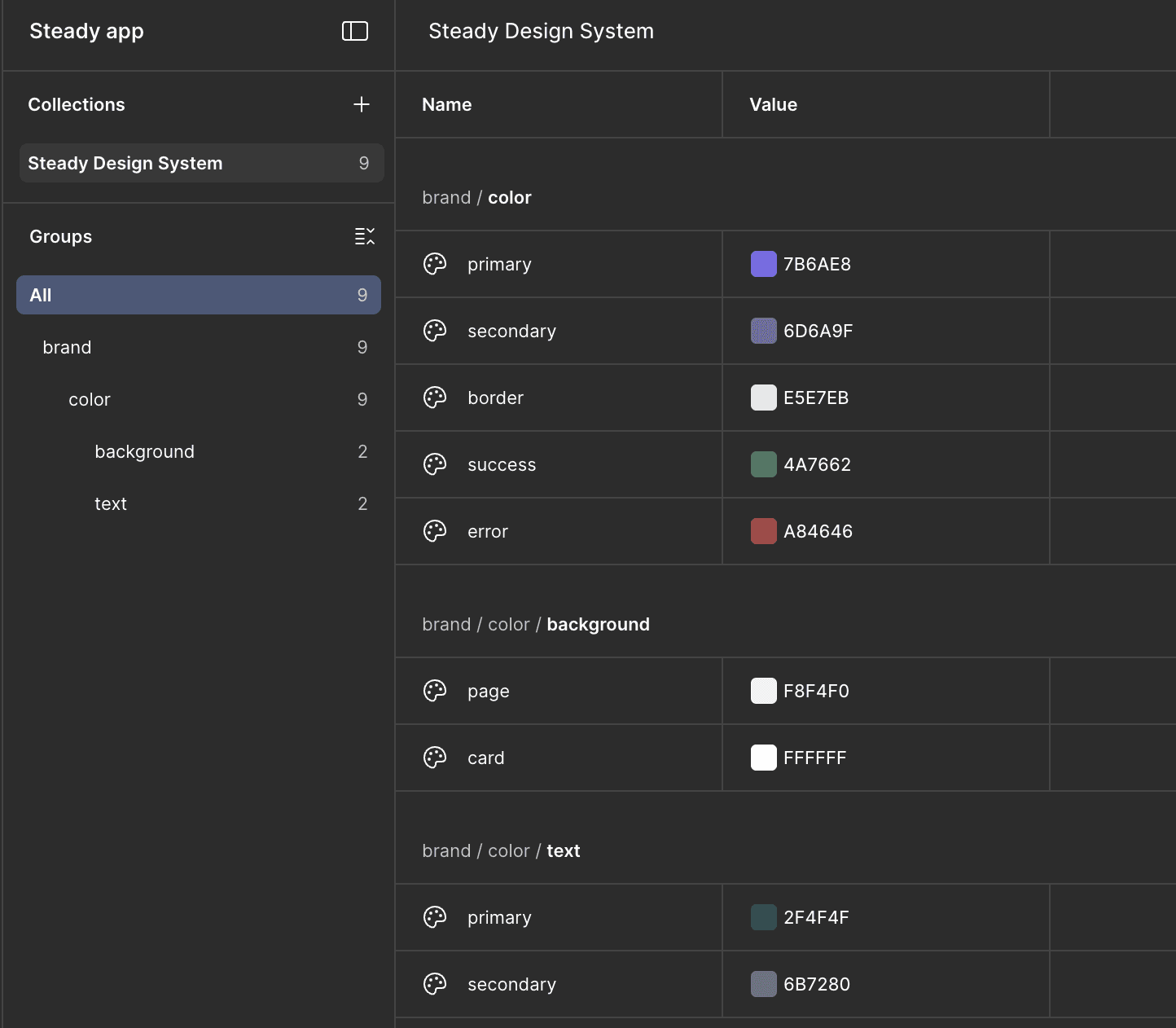
Design & System
Steady uses a modular design system with reusable components, making the interface consistent and easy to use. Colors, shapes, and typography reflect the brand’s calm and friendly personality. Messages and labels are clear and human-centered, reducing anxiety and giving users confidence. Small interactions, like tapping a card or confirming a transfer, provide feedback and control, reinforcing trust. Every screen feels coherent, professional, and aligned with the brand, making complex banking simple and reassuring.
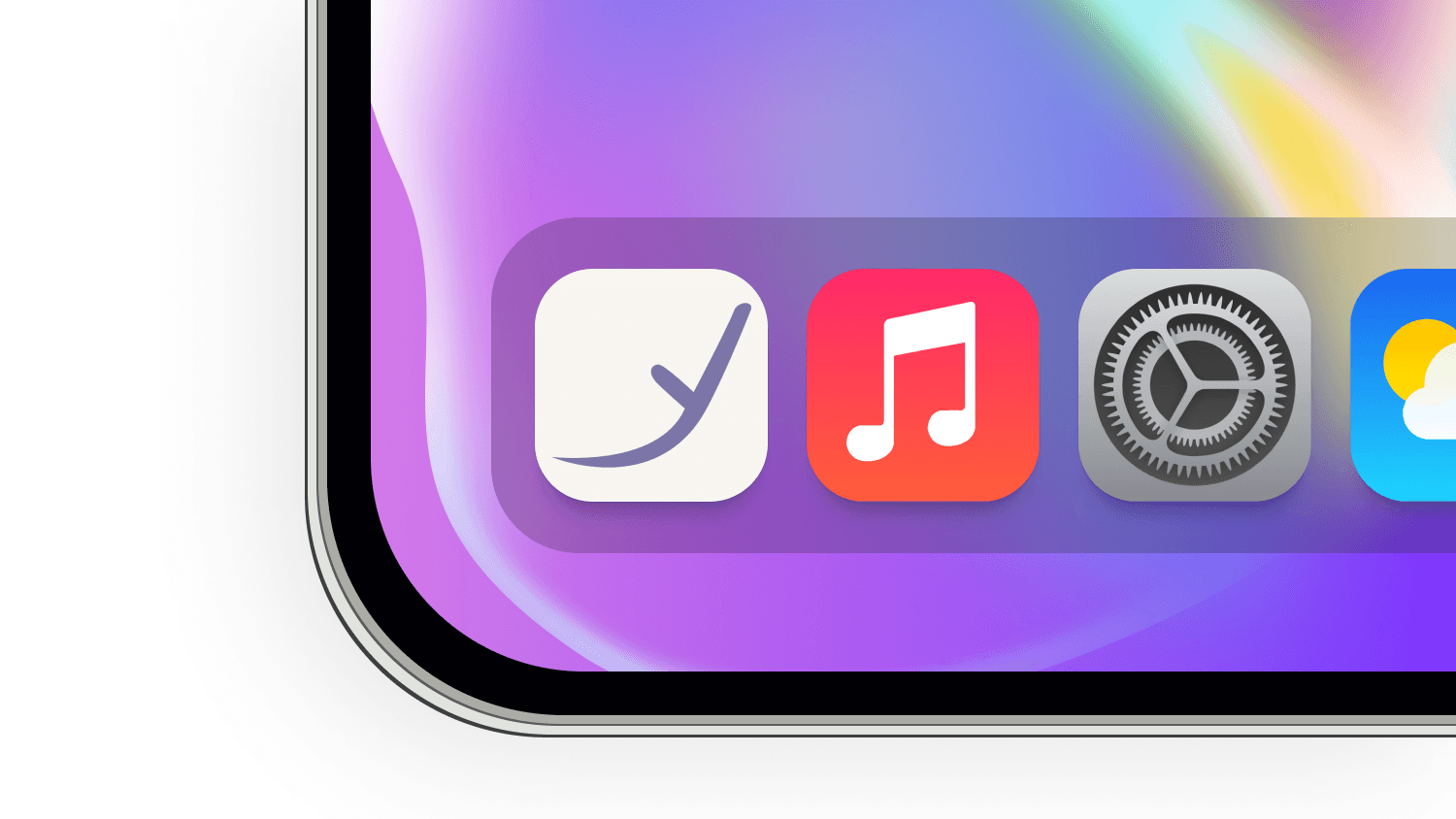
Brand & Outcome
The Steady brand is designed to feel friendly, professional, and trustworthy. The logo has a handwritten style that communicates approachability while remaining serious and reliable. Its payoff clearly expresses the app’s goal, reinforcing the promise of calm and control for users. The letter “y” is used as a unique symbol in the app, with soft, positive colors that appear throughout the interface. The animated logo is minimal and clean, adding a subtle touch of personality and further strengthening the brand identity.


Made by Andrea Picariello with Framer
Made by Andrea Picariello with Framer