Liquidity Management Tool — SaaS B2B (Fintech)
Role: Product Designer
Type: Concept project
Year: 2026

Liquid is a SaaS tool designed for CFOs and finance teams to monitor liquidity and plan financial decisions in the short term.
It provides a structured way to move from raw financial data to clear understanding of available cash, risk exposure, and future obligations.
Finance teams often struggle to answer critical questions:
How much cash is actually available?
How much is already committed?
How long will the company remain operational?
What payments will impact liquidity soon?
Data is often fragmented and hard to interpret, leading to uncertainty and slower decision-making.
Instead of designing a generic dashboard, I designed a liquidity decision system.
The product follows a clear logic:
Each step supports a different level of understanding and decision-making.
The system is composed of four main views:
Dashboard
Cash Flow
Obligations
Reports
The dashboard is designed to provide an immediate understanding of the company’s financial position.
It answers four key questions:
How much liquidity is available?
How much is at risk?
How long will it last?
What will impact cash soon?
The key metric is Safe to Allocate, which represents the actual usable cash after accounting for obligations and a safety buffer.
This avoids misleading interpretations of total cash.
The Liquidity Exposure indicator shows how much of the liquidity is already committed, helping distinguish between available and risky cash.
The Runway translates financial data into time, making it easier to understand how long the company can operate.
The Upcoming Obligations table connects overview to action by showing payments that will impact liquidity.
This view focuses on how liquidity evolves over time.
It separates:
inflows
outflows
net result
The net line is critical because it shows the actual outcome, not just activity.
This helps finance teams understand whether the company is generating or consuming cash.
The table allows users to move from aggregated data to detailed transactions.

This view shows all upcoming payments.
The table is structured to support prioritization:
sorted by due date
enriched with impact level
filterable by type and risk
This allows teams to quickly identify:
urgent payments
high-impact obligations
potential risks
The focus is clarity on what requires attention first.

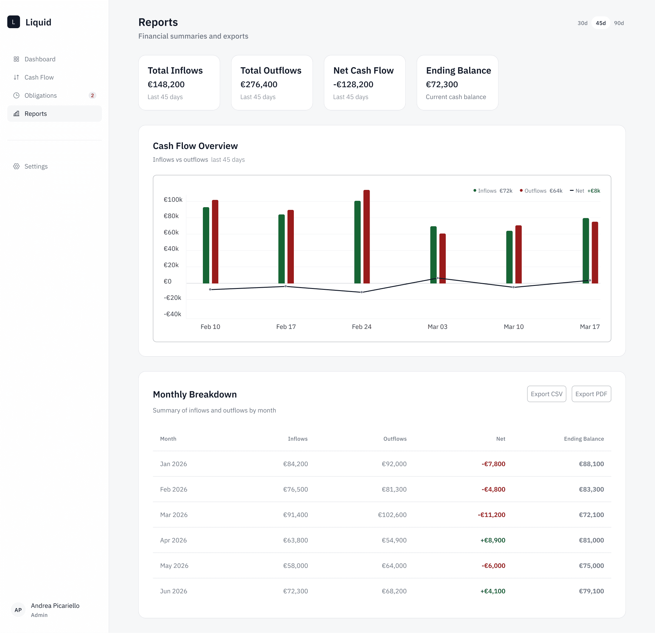
The Reports section provides a higher-level overview.
It focuses on:
aggregated inflows and outflows
net result
monthly breakdown
This view is used for reflection and communication rather than daily operations.
This project demonstrates the ability to design:
data-heavy SaaS interfaces
financial decision-support systems
structured multi-screen products
It reduces ambiguity by making liquidity, risk, and future cash dynamics easier to understand.
Designing financial tools is not only about visual clarity.
The main challenge is structuring information in a way that supports decisions.
How data is framed has a direct impact on how users interpret and act on it.